
Written by Mollie Talbot for The KC Scene
Mention of the “KC heart” evokes two main images for Kansas Citians:
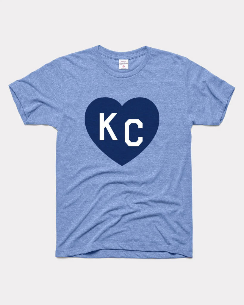
the T-shirts made famous by Charlie Hustle since 2011, and the five-and-a-half-foot artistic statues you’ve seen countless times, in countless shades and designs, in countless locations throughout the metro.

In 2020, KC’s Parade of Hearts was started. The KC heart sculptures hit the scene as an auction to showcase local artists while raising money for businesses and nonprofits suffering financial repercussions from COVID shutdowns. In just a few years, what started as a small, uncertain band-aid to preserve KC arts and businesses has fast become an integral addition to the tapestry of modern Kansas City culture. As if that isn’t enough, since its inception, over 2.5 million dollars have been raised and recirculated back into KC in the areas of health and wellness, hospitality and tourism, education, minority-owned businesses, and charitable organizations.
But the Parade of Hearts is on hiatus this year. In March of next year, capitalizing on the FIFA World Cup boom, 150 local artists will debut their work on a brand new Parade of Hearts sculpture design.
And to put it plainly, I don’t like it.
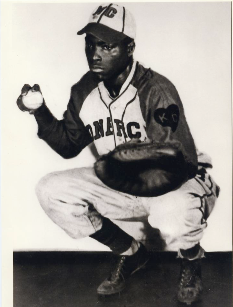
When Kyle bought me my first Charlie Hustle KC Heart shirt while we were living in Denver in 2015, I assumed they’d designed the now-famous graphic of “KC” enclosed in a heart, but I was wrong. While even Charlie Hustle founder Chase McAnulty is said to have taken inspiration for the iconic shirts from a patch worn by the championship-winning 1942 KC Monarchs, the symbol originates further back than that.
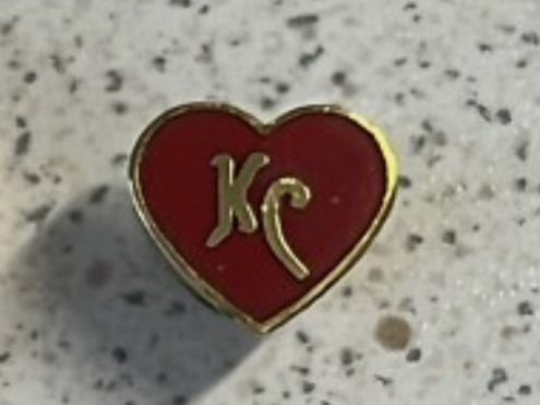
The KC heart began as a pin worn by rail workers based out of Kansas City in the early 1910s, representing pride for their home base in America’s “heartland.” With rail arteries connecting us to the rest of the country, and the rest of the country to us, KC was the beating heart of America’s rail system. “KC,” displayed at the pin’s heart center, left no doubt where a rail worker hailed from. The same can be said of the famous Charlie Hustle shirts.
The central display of “KC” on pins, patches, and the previous Parade of Hearts sculptures has always represented hometown pride. So why does the 2026 sculpture design remove it? I sat on my hands after seeing the new design and feeling critical of it, mostly due to the feminine fear of being “too much” or, heaven forbid, complaining. But one validating conversation with my seven-year-old later showed it doesn’t take a professional artistic contributor to question who the new design benefits or represents, because it doesn’t seem to be the artists, the history of our city, or really even our city at all.
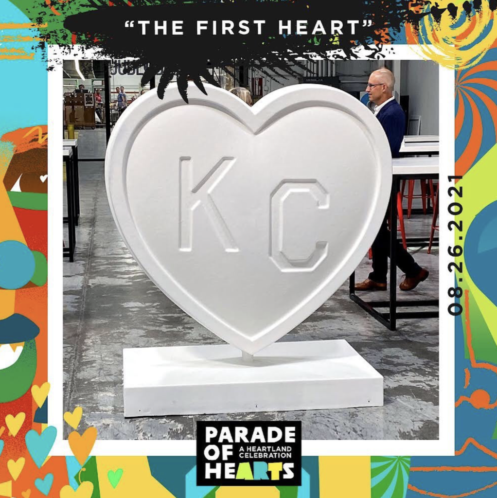
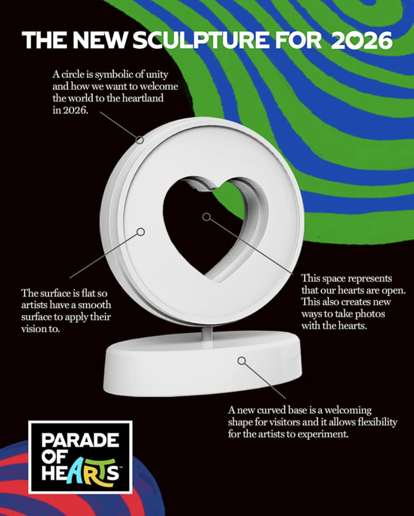
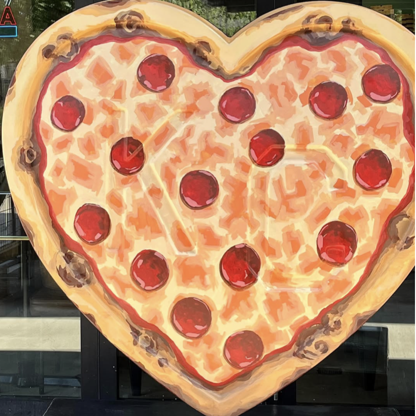
The 2026 Parade of Hearts design was selected by “an adjudication committee of eight architectural designers,” who considered 35 different submissions and settled on… a hollow heart. No “KC” in sight, and the artists’ “canvas” relegated to an outline. It feels more like something my boys would stick their heads through at the KC Zoo for a photo, and my seven-year-old had questions: “How are you supposed to draw a pizza on that?” (His favorite example sits in front of City Barrel Pizzeria in Waldo.)
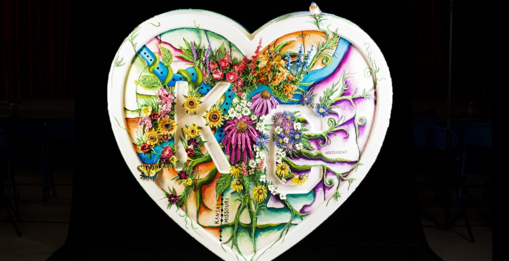
After showing him my favorite heart from past years, Bloom Where You Are Planted by Mary Beth Maschler, he immediately noticed the loss of the central “KC” image and asked how people will know the sculptures represent Kansas City.
So I’m mustering the confidence of a seven-year-old to say, I don’t get it. Further, why did we have a committee of architectural designers weigh in instead of the wealth of KC artists we have at our fingertips, who actually create the sculptures? Why are we reducing the artistic area by half for a load of negative space? Does the previous design fall prey to high winds? Is the hollow design lighter or less expensive?
True, not every previously adorned heart accented the iconic “KC” in its center; some artists chose to paint the raised letters into their designs. But I’d argue the most popular designs in the archives highlight the KC within their masterpieces, paying homage and taking pride in who their individual creations represent and benefit.
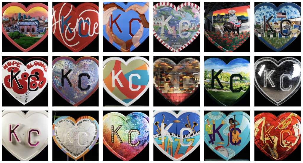
(See past hearts archive: https://theparadeofhearts.com/hearts/)
While executive director of the Parade of Hearts Jenn Nussbeck is quoted as saying the new design is “our global welcome to the region,” it rather patently forgot to mention the region. Sure, you can argue the new design represents all of the heartland, but why, when it was created to represent and bolster Kansas City specifically? In the age of social media geotagging, the new design seems to be geared more toward Instagram photo ops for people to stand inside, rather than the original design’s stand-out purpose of displaying pride for the city’s wealth of artistry and devotion to uplifting our community.
While some believe the design offers a challenge for artists to creatively embrace the possibilities of negative and positive space, I think it washes out what was already pretty perfect, a large space for artists to work with that irrefutably represents KC and its history.
Another person was quoted calling it a beautiful symbol of “how we can actually come together in our emptiness,” but I actually laughed out loud when I read that. While I’m all for deep diving for artistic meaning, this reads like someone trying to sell something.
In the words of Abby Brisbane, artist and barista extraordinaire I’m chatting up while writing this: “While the current design choice is a classic, timeless proposal that welcomes a little heart, the new model doesn’t echo that homage to the arts in the city we’re proud to parade!” and “If the Parade of Hearts is meant to showcase artists, why did we take half their canvas?”
I couldn’t agree more.